Examples · Type foundry
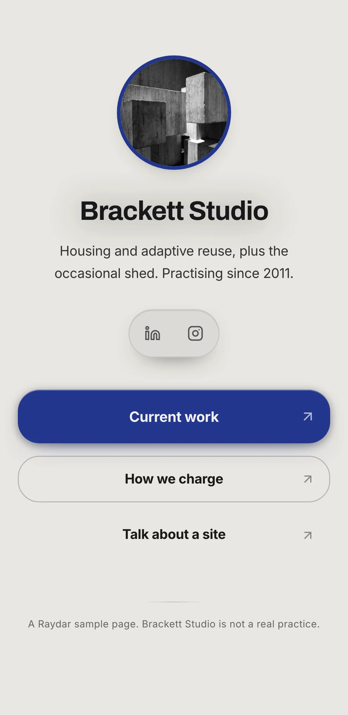
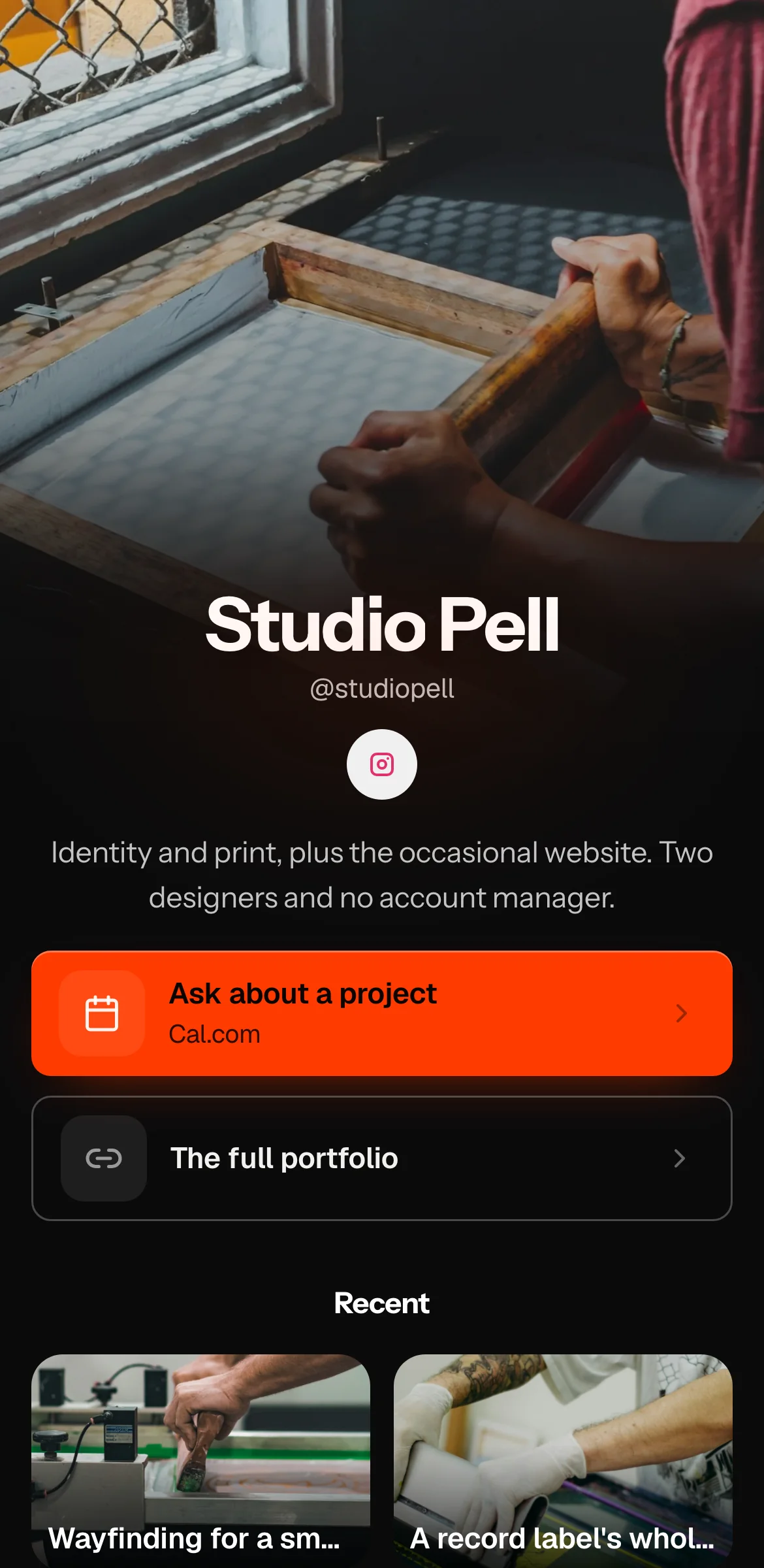
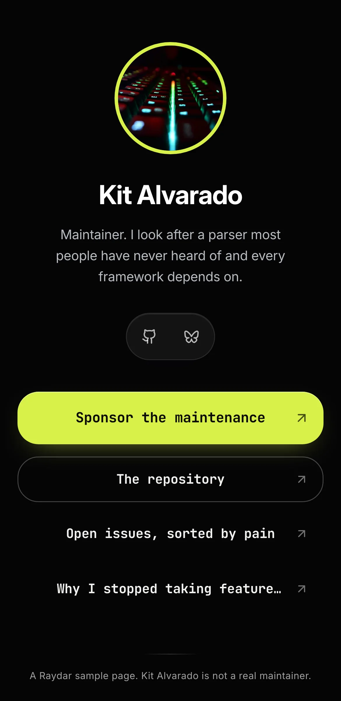
Vellum and Vine, a link in bio template for a type foundry
An example page for a fictional type foundry. Vellum and Vine is not a real foundry.
Start your page free · Open the live example
Why it is built this way
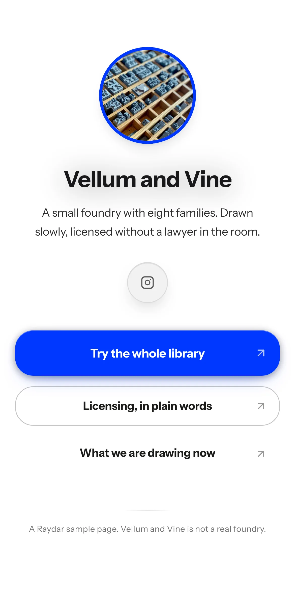
A designer choosing a typeface for a client wants to test it in their own layout, check what the licence allows and see whether the foundry is still active. Vellum and Vine's three buttons answer those in that order.
"Try the whole library" comes first, because designers test type before they license it.
"Licensing, in plain words" names the most dreaded part of buying type and promises to make it painless. It backs up the bio's line about licences drawn up "without a lawyer in the room."
"What we are drawing now" shows the foundry is alive and gives repeat visitors a reason to return.
The design is close to pure typography. The page is white (#FFFFFF) with dark grey bio text (#2C2C2C), and a single electric blue (#0038FF) carries the buttons and circles the photo, with white lettering. For a foundry the letterforms are the product, so colour is limited to one signal. Name, bio and buttons all use Instrument Sans, one family across the page, the kind of discipline type designers notice. Square buttons keep the geometry strict, and the classic layout keeps it to one column.
The bio's opening also works as a spec: "A small foundry with eight families." A buyer knows the size of the catalogue before tapping anything.
What is on the page
- Classic layout
- Fonts: name in Instrument Sans, bio in Instrument Sans, buttons in Instrument Sans
- Colours: buttons #0038FF with #FFFFFF text, background #FFFFFF, bio text #2C2C2C, profile ring #0038FF
- Square buttons
- Button 1: Try the whole library
- Button 2: Licensing, in plain words
- Button 3: What we are drawing now