Examples · Graphic design studio
Studio Pell, a link in bio template for a graphic design studio
Studio Pell is a fictional graphic design studio. This is an example page we built to show the template.
Start your page free · Open the live example
Why it is built this way
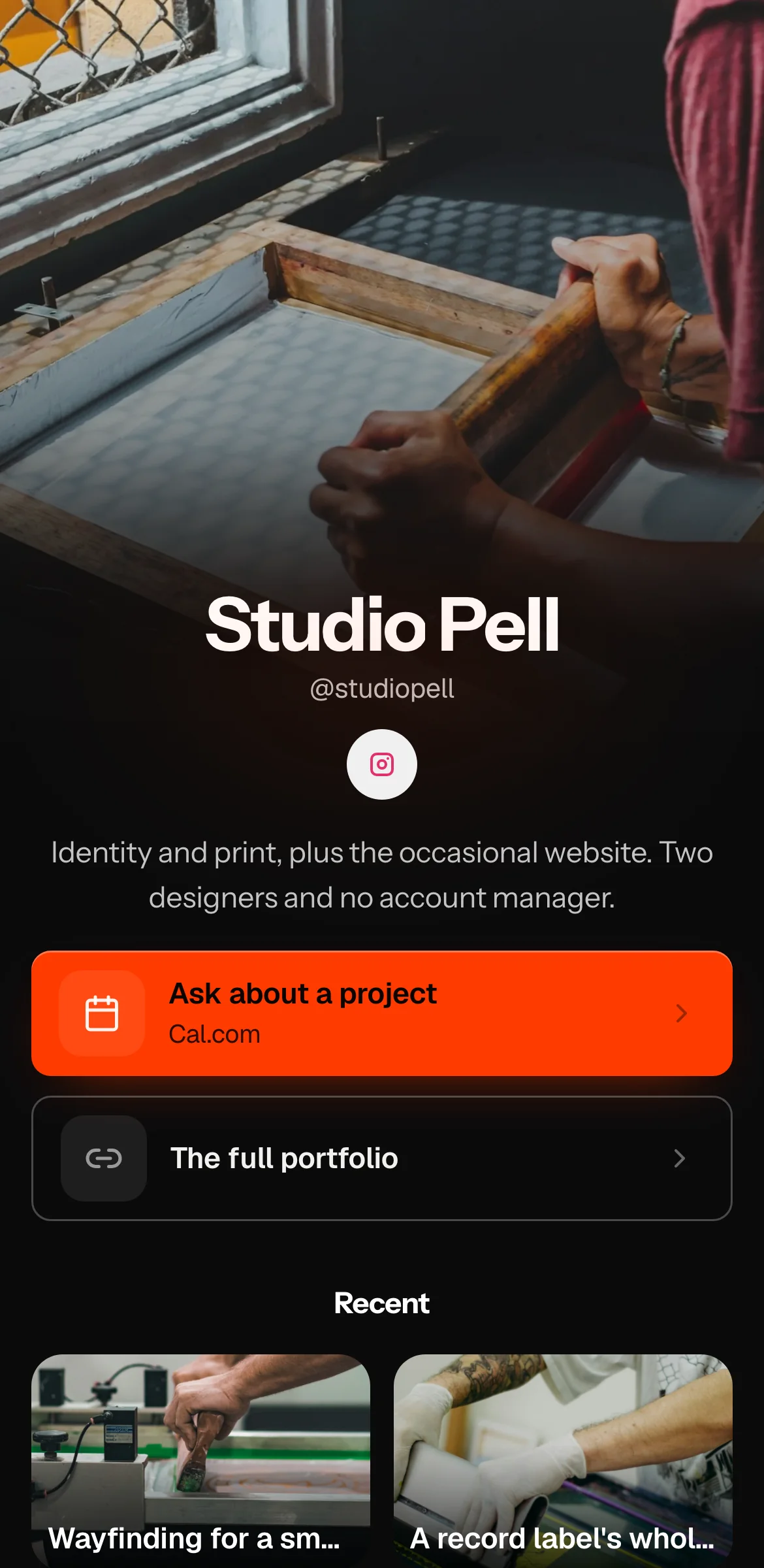
A design studio's own page is a portfolio piece, so Studio Pell makes one bold decision and lets everything else serve it: a single red-orange (#FF3B00) on black.
Near-black (#0B0B0B) covers the page, the bio text is a mid grey (#C4C4C4), and the red-orange is used twice, on the lead button and around the profile photo, with near-black lettering (#0A0500) on the button. On a dark page one saturated colour hits harder than a palette of five, and the restraint is itself a sample of what identity clients are paying for.
Instrument Sans is set for everything: name, bio and buttons. A studio that does identity work and uses one typeface on its own page is making a point about consistency.
The two buttons are "Ask about a project" and "The full portfolio". The enquiry comes first, because people reaching this page from a studio's Instagram have often seen the work already. Under the buttons, the Nucleus layout leaves room for recent projects.
The bio is the other thing worth copying: "Identity and print, plus the occasional website. Two designers and no account manager." That last clause tells a client they will talk to the people doing the work, which for a two-person studio is the selling point.
If your brand is one strong colour, build the page around it and keep the button count at two.
What is on the page
- Nucleus layout
- Fonts: name in Instrument Sans, bio in Instrument Sans, buttons in Instrument Sans
- Colours: buttons #FF3B00 with #0A0500 text, background #0B0B0B, bio text #C4C4C4, profile ring #FF3B00
- Square buttons
- Button 1: Ask about a project
- Button 2: The full portfolio
- Content section below the buttons