Examples · Documentary photographer
Nadia Osei, a link in bio template for a documentary photographer
An example page for a fictional documentary photographer. Nadia Osei is not a real photographer.
Start your page free · Open the live example
Why it is built this way
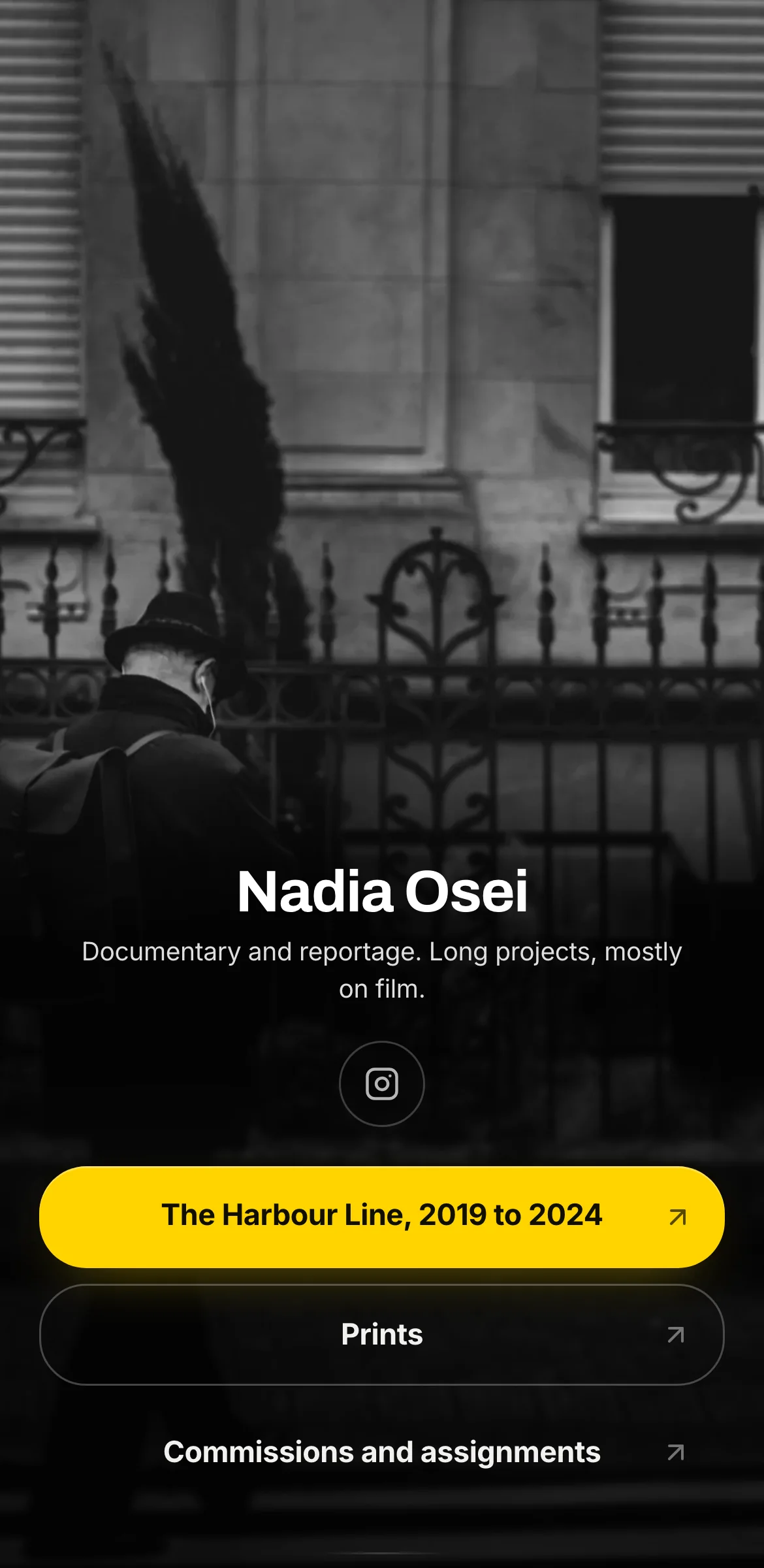
"Show me the long project." An editor or curator looking at a documentary photographer wants depth, and this page leads with it: "The Harbour Line, 2019 to 2024".
From the top, the page opens on a photograph with the name laid across its lower edge, which is how the editorial layout works and exactly right for someone whose work is images. The bio follows: "Documentary and reportage. Long projects, mostly on film." Then three buttons. The first names a project and the years it ran, which tells a visitor this is committed work. "Prints" serves collectors. "Commissions and assignments" serves editors and agencies with paid jobs.
The palette is black and white with one exception. A near-black background (#0C0C0C) and light grey text (#DEDEDE) let monochrome photographs sit naturally, and a single yellow (#FFD400) fills the first button with near-black lettering (#111000). That yellow does the job of a grease pencil on a contact sheet: it marks the one frame to look at.
Archivo sets the name with a firm, newsy weight, and Inter keeps the rest plain. Square buttons echo the edges of a print.
One body of work that should lead, plus a couple of ways to buy or hire: if that describes your practice, this is the layout.
What is on the page
- Editorial layout
- Fonts: name in Archivo, bio in Inter, buttons in Inter
- Colours: buttons #FFD400 with #111000 text, background #0C0C0C, bio text #DEDEDE, profile ring #FFD400
- Square buttons
- Button 1: The Harbour Line, 2019 to 2024
- Button 2: Prints
- Button 3: Commissions and assignments